Portal
General Description
The portal is a website for access to the ZDMP functionality including, everything from human collaboration to container management depending on the user’s role and permissions. It displays web UIs from the zApps and provides information to the decision makers that require it.
This is the front facing interface to the platform. From here users can login to the platform see available applications (depending on their access).
This component is on the Enterprise tier and is part of “user frontend plane”. It allows people access to various parts of the platform including the Marketplace to buy and install zApps as well as connecting to running applications within the Application Run-time.
| Resource | Location |
|---|---|
| Source Code | Link |
| X Open API Spec | Link |
| Video | Link |
| Online Documentation | https://software.zdmp.eu/docs/components/enterprise-tier/portal/ |
Screenshots
Component Author(s)
| Company Name | ZDMP Acronym | Website | Logo |
|---|---|---|---|
| Information Catalyst for Enterprise | ICE | www.informationcatalyst.com |  |
Commercial Information
| Resource | Location |
|---|---|
| IPR Link | Portal |
| Marketplace Link | https://marketplace-zdmp.platform.zdmp.eu/63ece97acec7d |
Architecture Diagram
The following diagram shows the position of this component in the ZDMP architecture
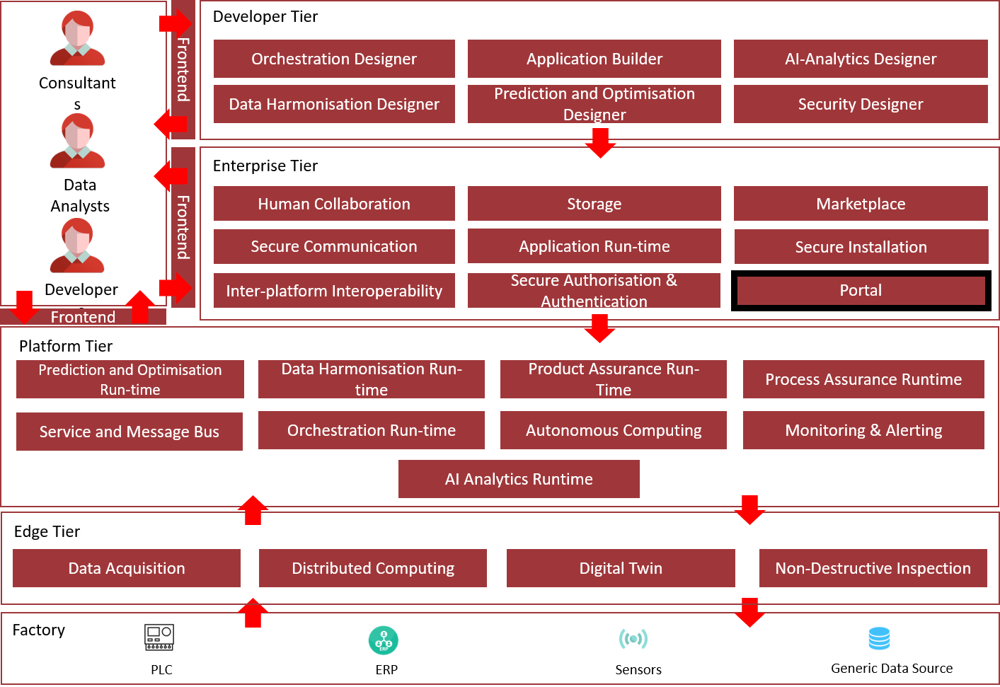
Figure 3: Position of Component in ZDMP Architecture
Benefits
The benefits include:
Provide common login/logout and access to components header
Act as a bridge between security component and other ZDMP components
Provide consistent look & feel
Access to user management for non-IT users
Features
The ZDMP Portal offers the following features:
ZDMP Global Dash Button: This is a global addition to all components. This provides all sites with a header to give user a common way to access his profile, logout, and switch between system components
User profile with roles: The main screen where user can provide metadata like photo, address, and other information
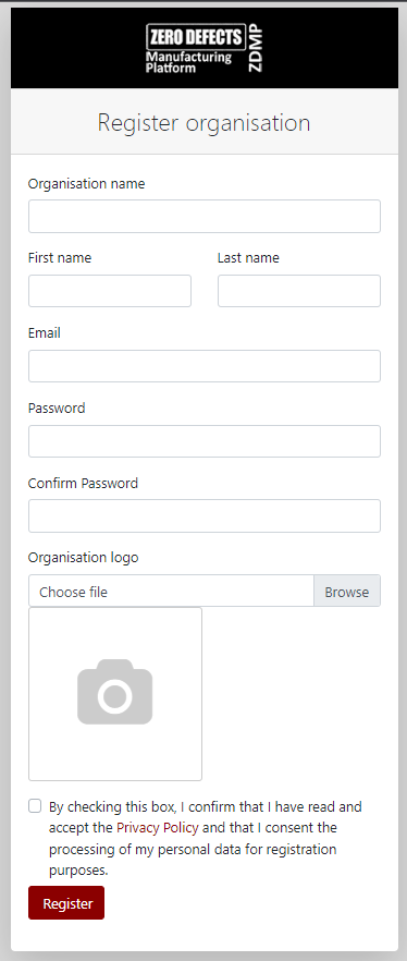
Organisation registration: Allow new organisations to be registered in the system
Access to all ZDMP components: Integrated login experience and access to all ZDMP components
Access to owned products: Integrated with Marketplace so the list of products is dynamic and shows elements owned/accessible by the current user
License check: Integration with Product License Manager, so it triggers a new organisation event (after an organisation has been registered) and show/hide products depending on their license status
System Requirements
The ZDMP Portal has the following requirements:
- Docker
Associated ZDMP services
Required
Installation
The ZDMP Portal can be installed using the following steps for development purposes:
Download the latest source code from ZDMP repository
Execute docker-compose from orchestration folder
Access localhost:4200 from their browser to reach Portal main UI
For an on-premise installation of the portal using miniZDMP it is deployed using Rancher and the helm charts created in conjunction with the Application Runtime, and from the ZDMP Marketplace.
Below is a description of the variables that can be set from Rancher:
Select the template version to install and Name as default (it can be changed)
Namespace as default (it can be changed)
Helm Options set to default values
Private Registry Settings:
Private Registry URL as default if deploying it from standard zdmp repository or change
Enter the registry user and password and leave the registry secret with default values
Repository: Image Repository as default or change if using a different repository
Database: set to True in order to enable local database of the portal or False to use the storage component database from ZDMP (need to deploy it OnPremise)
Services and Load Balancing:
Ingress Configuration to true or false if enabling ingress, select the ingress domain name to be used
Environment Configuration: change the domain name of some configuration url to the domain name set in the ingress configuration
Portal-Api URL: the url of the portal api
Portal-Api Keycloak URL: the url for the portal api to connect to Secure Auth
Portal-Frontend URL: the url of the portal frontend
Portal-Api Auth Api URL: the url for the portal api to connect to auth api (Secure Auth)
Click on Launch Button
How to use
The ZDMP Portal can be used following these steps:
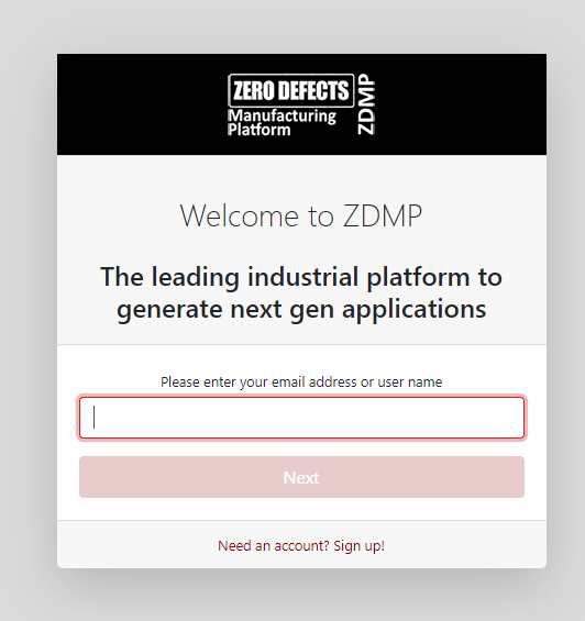
- Welcome page
This page is what the user sees when first goes to ZDMP Portal site. The User enters their email address and then clicks Next.
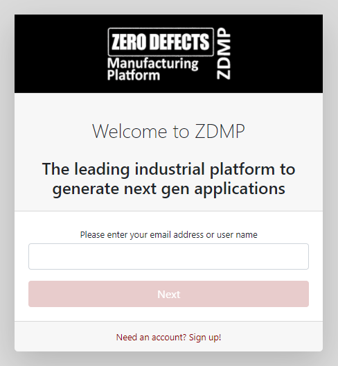
Figure 4: Portal Welcome page
- Select organisation
Here the user can select any organisation by clicking on its name. It is then redirected to the login page.
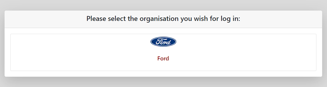
Figure 5: Select organisation screen
- Login is provided by Keycloak (via the security component)
This screen is where the user is logged into the system, using the organisation chosen.
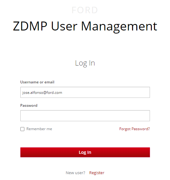
Figure 6: Keycloak login
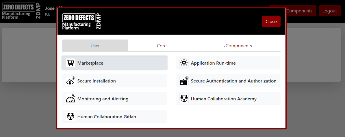
- ZDMP Components
Once logged in, user is able to access the ZDMP Components screen.
This screen provides links for all components in ZDMP, thus becoming the main access point to all ZDMP components. This has been automatically populated based on which components/configuration the user has selected.
This functionality is also provided by the Dash button.
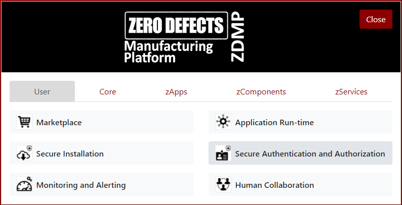
Figure 7: ZDMP Components
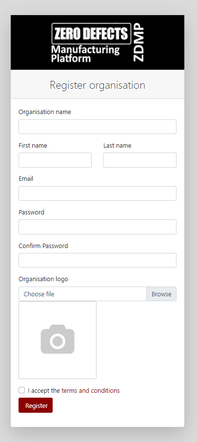
Figure 8: Register organisation screen
Dash button
- Overview
The ZDMP Dash button is a Portal component that can be integrated by any ZDMP component and/or ZDMP application, to help the developer with the tasks related to the security, including validating current user, registering new organisations and authentication.

Figure 9: Dash button in ‘anonymous’ state
- How it works
The Dash button appears at the upper right corner and provides a single sign on experience for the end user.
It has been built using web components technology, so it can be integrated on any web page/application easily.
When the end user clicks on the Dash button, it is redirected to the main Login screen.
After a successful login, the user is redirected back to the original application, showing a ‘connected’ status, with the user’s organisation logo and username.
Figure 10: Dash button in ‘logged’ state
- How to integrate it
To integrate the Dash button on any existing web page, please follow the next steps:
A reference to the js Javascript file, placed in specific HEAD section
<script src="https://cdn.jsdelivr.net/npm/zdmp-dash-button@latest/zdmp-dash-button.js"></script>
A reference to the css style file, placed in specific HEAD section
<link rel="stylesheet" href="https://cdn.jsdelivr.net/npm/zdmp-dash-button@latest/zdmp-dash-button.css" />
A tag to position the dash button, placed in specific BODY section.
<body>
<zdmp-header api-url="http://localhost:5100"></zdmp-header>
...
</body>