Application Builder
General Description
The ZDMP Application Builder, also known as zStudio, supports developers with a UI aiming to define, design, develop, and compose zApps and manufacturing services. The primary purpose of this task is to facilitate the development process of zApps by providing a design time environment for their production including behaviours and UI elements. The frontend elements can be used in all Assets (zApps and potentially ZDMP components) where possible, but it is not mandatory if there is a good technical or aesthetic reason not to do so.
The zStudio consists of a frontend environment available for developers to create an initial structure of zApps and services. Along with the frontend, it includes a Service Backend, which offers methods to access functionalities of all technical components that the service developers need, such as messaging, storage, service provision, service use, workflow execution, and easy integration of data from various sources. The Service Backend contains an extensive, fully documented API framework that provides developers with the means to interact and use the APIs provided by other ZDMP components. The Application Builder includes programming tools to provide value-added service compositions.
The basis for the development of the Application Builder is to provide a framework of elements that support the development of services and zApps for ZDMP. The Application Builder provides an UI editor for zApps to the developers. This enables the drag-and-drop elements to embed the resources and services that a zApp requires, as well as to access design orientated data stored in ZDMP (models, patterns, and behaviours).
The Frontend Environment provides a common behaviour for UI elements to developers. To enable this, a relevant set of UI elements with pre-defined business logic is included in the component. The Frontend Environment is the primary actor to simplify UI dependency management, eg, a login/registration form with underlying business logic to communicate with the platform for user management; a bug reporter, which enables users to report any technical issues related to ZDMP to the zApp developer; a translation tool for users to translate zApps and services into other languages.
| Resource | Location |
|---|---|
| Source Code | Link |
| Online Documentation | Link |
| X Open API Spec | None |
| Video | Link |
Screenshots
The following images are illustrative screenshots of the component.

Component Author(s)
| Company Name | ZDMP Acronym | Website | Logo |
|---|---|---|---|
| Ascora GmbH | ASC | www.ascora.de |  |
Commercial Information
| Resource | Location |
|---|---|
| IPR Link | Link |
| Marketplace link | Link |
Architecture Diagram
The following diagram shows the position of this component in the ZDMP architecture.
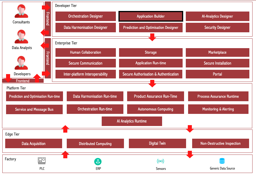
Figure 1: Position of Application Builder Component in ZDMP Architecture
Benefits
The benefits are:
Help developers to create a zApp using UI components, which can be added with a single click
UI components are linked to ZDMP services through APIs
UI components are linked to other ZDMP components, including message bus, Monitoring and Alerting, storage, authorization, authentication, and Marketplace
zStudio ensures that certain basic functionalities which every zApp requires, such as notifications, dashboards etc, are available in a standardized manner to all zApp developers
A zApp with a specific industrial use case can be quickly created with readymade components, which are hooked to a ZDMP application
Features
Application Builder offers the following features:
zApp Creation
User Authorization and Authentication
Error Reporting
Multi Language Support
Application Logging
Notification Template
Automatic Updates
zApp packaging
Receiving data from message bus
Chart/Graph representation of message bus data
Sending data to message bus topics
Sending alerts using Monitoring and Alerting
Exporting a Docker image of a zApp
zApp maintenance with human collaboration gitlab
Sign into the Portal and access other ZDMP components
Marketplace exports
zApp Creation
The Application Builder enables developers to create a fully functional zApp and then upload it to the Secure Business Cloud. After this process, the new zApp can be delivered to clients / users. The zApp template created by the Application Builder is expected to make development easier and faster. Even if in most cases adaptation and extensions have to be implemented to create more than basic applications, the provided examples demonstrate how to use the APIs and components used within ZDMP and should make a quick and intuitive starting point for developers.
A zApp is composed of following UI elements and templates:
UI elements: Various UI elements are provided in the zStudio to be used by developers. These elements come as defaults but are also customizable for its respective purpose. These range from charts and diagrams which can be data-bound to ZDMP services (zAssets), through to an “About” page with information and informative links
UI templates: The zStudio provides UI templates which are precomposed compositions of UI elements from the UI Element Repository. Each template appears as a single UI element but is composed of several UI predefined elements. A lightweight example of a UI template is a login form, which is composed of a grid, textbox, password-textbox, and buttons
Behaviour elements: Behaviour elements provide default behaviours for activities, which are related to UI interactions. Those behaviours are easy to integrate and applicable for, eg forms, downloads, registration, notifications etc
Behaviour templates: Behaviour templates consist of sequenced behaviours that are processed synchronously. These behaviours ease the use of handling events and support developers with additional default events
Holistic templates: Holistic templates provided by zStudio unite UI templates and behaviour templates. These templates include logic to manage user interactions automatically, eg a zApp template which already includes error management, contact forms with default mail templates etc
User Authorization and Authentication
The user can register or login to ZDMP with this function easily. A UI is provided with a connection to the Security component, which manages the registration and login process. For registration, the user enters a valid email address, first name and last name. The Security component then takes over and replies with a confirmation email to the entered email address, as double-opt-in confirmation by the email is necessary to comply with the GDPR. In the case of a login, only the user credentials (username and password) are necessary. Again, the Security component takes over for the verification of the credentials and responds with granted or denied access.
Error Reporting
Where errors in ZDMP Assets are recognised and for troubleshooting reasons, reports are forwarded to the administration area of the Secure Business Cloud. There, developers can examine the error reports to react quickly with bug fixes. Error reports consist of information about the sender, client operating system, application, time, and the error itself (eg exception stack trace).
Multi Language Support
Internationalization is a major feature which every zApp may need to support. With the Multi Language Support feature, a user can switch languages in any zApp. In addition, a resource editor (translator) is provided, which shows in a default language file (English) all strings which can be translated into the language the user speaks or be switched to any language that is already provided. This translation does not happen in the application, so only the language file is needed to do a translation. After translation has been performed, the user can request to add the translation to the official application. Then it depends on the developer if the new translation is accepted or declined.
Application Logging
Logging is a default debugging mechanism used during the development of a zApp as well as at runtime for bug-fixing. With this, internal processes are logged and saved to an additional logfile. This file then can give the developer hints about possible error messages and eases troubleshooting. Information of the log can be displayed in the client application.
Notification Template
Through this feature, developers can provide the functionality to raise notifications to make users aware of relevant information, depending on the user management system of the ZDMP Security component. The idea is to enable developers to quickly integrate the API without having to care about user management, access rights and the targeted presentation of the notifications in the client applications of the factory workers etc, which should reduce time to enable these kinds of features by at least 50 %.
Automatic Updates
This is a mechanism used to maintain zApps after development and upload to the Marketplace. This feature provides functionality of automatically updating zApps after a new version was created for release, for example when bug fixes or new features were implemented by the zApp developer. Having a standard way to enable updating is a basic feature of all mobile Marketplaces, as this takes away the setup of the necessary infrastructure and enables a common user experience between different zApps.
zApp Packaging
A zApp package consists of source code, a manifest file, a docker image and deployment files. The zStudio generates the following pieces for the developer:
Source code: Source code of a zApp. These source files are generated by the Application Builder as a first step: it builds a code skeleton - a template of basic functionality. Afterwards, the zApp developer can expand this basic code structure so that the zApp fulfils the required function
Manifest file: Mark-up file with extra properties/metadata of the zApp. The initial template is generated by the Application Builder, but the developer has to complete it
Docker image: When running the zStudio, a docker image can be exported by clicking on the button “Export Docker”
Receiving data from message bus
The zStudio enables users to subscribe to message bus topics. From the list of all available topics, users can select a topic they want to receive data from. Each time any data is published to that topic, the users receive data which they can use, eg to display it in the form of graphs or plain data. To stop receiving data, the zStudio provides a possibility to unsubscribe from any topic from the available list of topics.
Chart/Graph representation of message bus data
Data coming from the message bus can be represented using bar charts. These charts are linked to the specific topic and monitor a default value. Both the topic and the value to be monitored can be customised by editing the code generated by the chart. Multiple charts can be used to monitor multiple values coming to a topic. For developers, seeing the data represented in a chart is an intuitive example of how to work with the chart/graph APIs provided.
Sending data to message bus topics
A user can send messages to a topic manually. The zStudio provides a UI element which consists of a list of available topics and a text box for messages. A user can select a topic from the list and type message which they want to send. Everyone who has subscribed to that specific topic can receive the data sent from zStudio. This UI element is a quick way to validate that the message bus is correctly connected and also a good way to start for a developer who wishes to access the message bus with their own code.
Sending alerts using Monitoring and Alerting
The zStudio shows how to monitor data coming from message bus by providing an UI element which lets users to enter a topic name and a value to monitor. The users can also provide multiple emails where they want to send alerts in case a certain value goes out of range.
The zStudio simplifies Monitoring and Alerting integration for the user. In the backend, zStudio creates a KPI, a condition and alerts using Monitoring and Alerting component, which are used to inform users if a value goes out of range.
Docker image export of zApp
The docker image of a zApp is needed to deploy the zApp into the application runtime component. When running the zStudio, a docker image can be exported by clicking on the button labelled “Export Docker”. The zStudio create then docker image. The backend executes a docker build -command and thereafter exports the created image as a download in the browser.
zApp Maintenance within Human Collaboration Environment (GitLab)
This is used for project maintenance in terms of creating, saving, loading, and deleting projects.
Sign into the Portal and access other ZDMP components
The Portal component is integrated to the Application Builder through the Dash Button, which is located in the upper right corner of the UI. The Dash Button allows a user to sign in to the ZDMP Portal, and thus, access other ZDMP components. The Dash Button also offers the option to register a new account if that action has not been conducted yet.
Marketplace exports
After developing a customized zApp solutions, with the help of the packaging configuration done in section 1.7.8, solutions are prepared to be submitted and at the end sold within the ZDMP Marketplace
System Requirements
Minimal requirements needed:
Virtual machine’s cluster formed by at least 1 machine with 1VPC, 4GB RAM and 20GB of disk, expecting to store the actual software docker images in the Storage component
Docker
Associated ZDMP services
Required
Optional
Code Structure
The main folders in the development project file structure are:
Documentation: This folder contains a set of .md files describing the Application Builder. It contains this deployment documentation, along with the Application Builder Guide explaining how to use it for designing frontend of ZDMP assets
Orchestration: This folder contains a set a Docker-compose .yaml file which orchestrates the Application Builder
Subsystems/zdmp-application-builder: This folder contains the Application Builder’s source code, developed with the framework Angular. It also contains “basic_apps” folder consisting of a sample zApp. Further apps created by developers are stored in the output folder
Installation
The Application Builder allows users to install it in four different ways.
ZDMP Platform Instance
The common way to use the Application Builder is the same as used with every other ZDMP Component: They are deployed on the ZDMP Platform.
https://zstudio-zdmp.platform.zdmp.eu
The deployment here already has taken place, following similar instructions as for the MiniZDMP instance below, but publicly available.
MiniZDMP Instance
To install the Applications and Service Builder on a miniZDMP instance, some preliminary work is necessary. To follow this guide, we assume that the installation and setup of the miniZDMP platform has been completed. Instructions on how to do this can be found here (https://gitlab-zdmp.platform.zdmp.eu/enterprise-tier/t6.4-application-run-time/-/tree/master/minizdmp or D087 Platform Integration and Federation).
In order for the component to be used with a basic version, no additional services are needed as requirement. Still, as zStudio integrated multiple other ZDMP components to be included into a zApp, additional services might need to be deployed to make use of them as well. See section 1.9 for compatibility information with zStudio and what is integratable, if in need, guided with information on how to do it.
- After following the guidance on MiniZDMP setup, login into your Rancher Instance and navigate to the Apps Section.
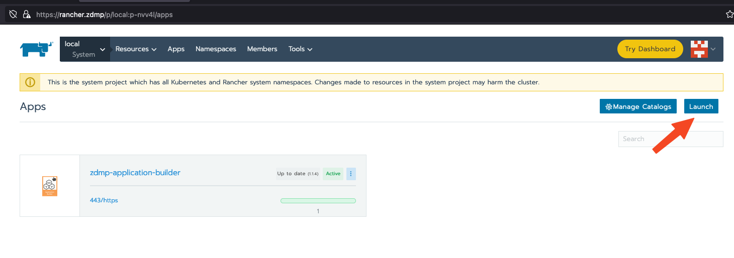
Please click on the Lunch Button to launch a new Application on the miniZDMP Kubernetes Cluster
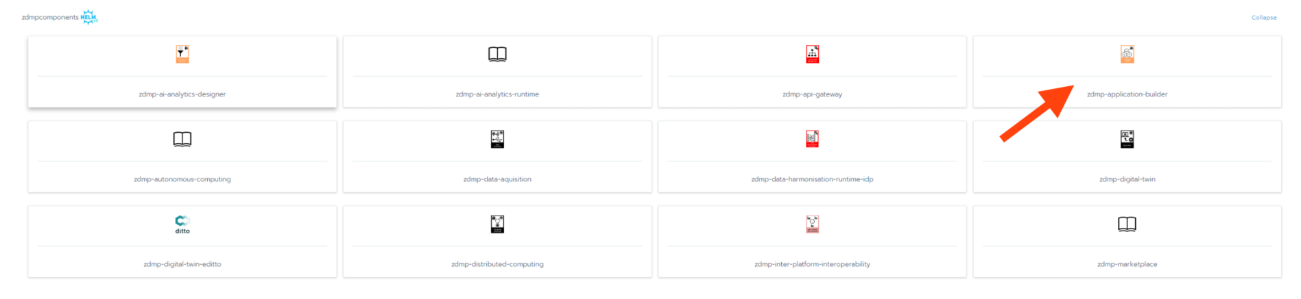
Within the catalog, search for the entry of “zdmpcomponents / zdmp-application-builder” and click on it.
In this step there are a few configurations needed, please set it to your needs:
Persistence Storage Type
Please set it to LOCAL or NFS. For NFS it is needed that you configure an NFS-Server in your miniZDMP Platform. Local means that the Data that are collected in this component will be saved to the local Server disk. Default selection is local, which will need no additional adjustmentsIngress
You can adjust here the domain name, where this component will be available. The default is set to zdmp.home which is also a default of the miniZDMP Platform.
- Private Registry Settings
These settings are necessary to download the container of registry of ZDMP. For the HCE Gitlab please use your own credentials as username and password.
- Please click on the Lunch Button, to start the process that the zStudio component will be deploy to the miniZDMP Cluster.
Non-virtual installation
If developers are interested in modifications within the zStudio itself, they are also allowed to access and install the code outside of any ZDMP Platform. This might potentially cause a lack of integration with other ZDMP components when they rely on zStudio to be used as part of the same platform. Still, this attempt is preferable for testing the Application Builder as standalone-component and for debugging locally.
The procedures explained are oriented on Windows (x64) within this manual. Nevertheless, the framework also can be set up in mac OSX or Linux environments. We will set up the server and client both on the same computer. You will need additional software to achieve this.
Git-SCM
Git is an open-source distributed version control system and later will be used to download / to clone the actual project. The software is available here: https://git-scm.com/downloads, offering solutions for Windows, but also Mac OS X and Linux. We recommend downloading the most actual version, which was 2.38.1 while writing this.
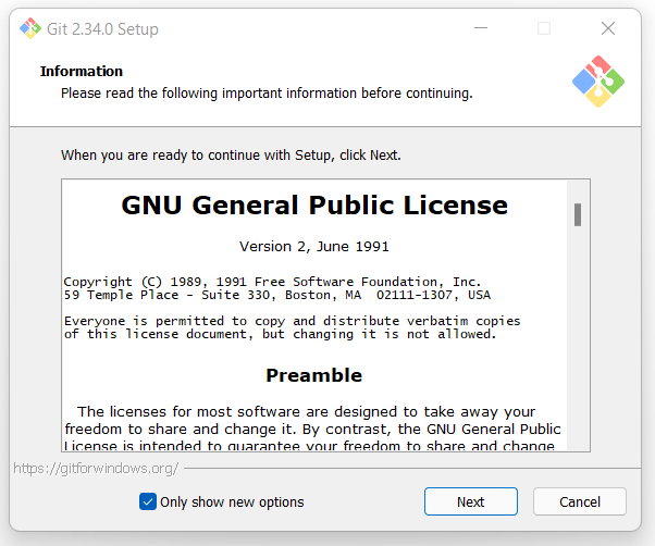 The installation setup will show up, presenting the End-User License Agreement in the first screen. Confirm this by clicking “Next.”
Afterwards, the setup will ask you about which components to install or leave out. In general, the pre-selection already done is suitable and we can go on.
Node.js
You can download your version here: https://nodejs.org/en/download/.
It is available for Windows, macOS and Linux Systems. The installation is tested for the Long-Term Service (LTS) – Version, so it is highly recommended to use this version instead of “Current”. Once this instruction was created, the latest LTS version was 18.12.1, including npm 8.19.2.
After your download, follow the instructions on your screen to install the software.

Start local execution
After all dependencies have been installed, ZDMP zStudio itself will be deployed to be able to run the server later. Therefore, a folder is needed where everything related to zStudio will be stored. In the following explanations, “C:\ZDMP\” will be used.
Navigate to the destination folder, right-click on the folder to see the context-menu. Click on “Git Bash Here” to open the console.
| ! | IMPORTANT: It is mandatory to use the Git Bash command line or any other Linux-compatible command line, as zStudio contains shell commands which are not suitable to Windows cmd, Powershell, or similar. |
Execute to following command to clone the official repository:
| git clone https://gitlab-zdmp.platform.zdmp.eu/developer-tier/t6.1-applications-builder.git |
If successful, your output should look like the below:

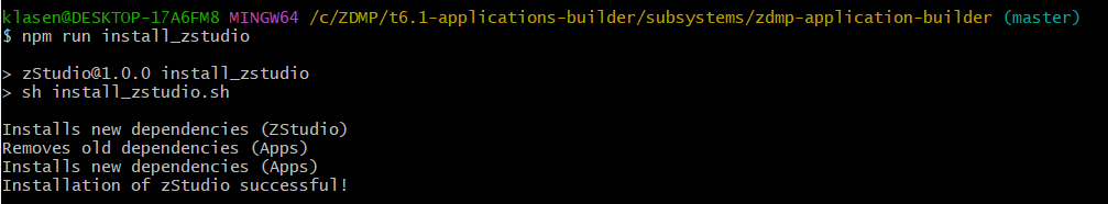
The dependencies of the project now need to be installed. Navigate to the folder:
| cd t6.1-applications-builder/subsystems/zdmp-application-builder |
… and trigger the installation. It will both set up zStudio itself and configure needed dependencies for the zApp we will create. This command also can be used if dependencies of zStudio and / or the application to develop have been changed.
| npm run install_zstudio |
If you see a confirmation appearing similar to the way below, everything went well, and you now can start using zStudio!
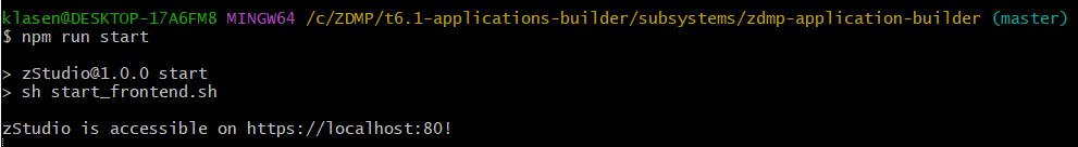
To get the server running, execute the command below:
| npm run start |
The console will state the URL which gives access to the user interface:
Docker Compose
With the help of Docker[1], the Application Builder can also be installed in a containerised environment. Similar to 1.11.3, zStudio will run on the local machine of the developer (or server), as standalone outside the ZDMP Platform. This comes with the potential integration disadvantage and the debugging advantage mentioned earlier.
The main difference lies in the containerisation aspect: zStudio will not directly be cloned on the hard drive of the user, but will be cloned, installed, and executed as part of a Docker container. As result, the repository does not need to be cloned completely, but only this file:
| https://gitlab-zdmp.platform.zdmp.eu/developer-tier/t6.1-applications-builder/-/blob/master/orchestration/docker-compose.yml |
Download it and copy it to the destination folder of your desire, eg “C:\ZDMP\”.
Ensure, that Docker is installed on your system by following their instructions for Docker Desktop[2] (macOS, Windows, Linux distributions), or Docker Engine[3] for Linux servers.
Navigate to your destination folder and execute:
| docker compose -f ./docker-compose.yml up –build –remove-orphans |
Similar to the non-virtual installation, you should see a confirmation that zStudio is running and accessible, with the difference, that it is part of container “zstudio” (light blue colour):
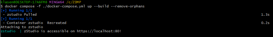
The zStudio source code here is accessible by entering a container directly on runtime. Changes within the code are not overtaken once the container terminates.
How to use
Please note that the intended audience for the Application Builder / zStudio are developers. The descriptions in this section might not be easily understood for non-developers.
The “How to use” part of this document gives an overview of the different components of Application Builder and demonstrate building a sample zApp to showcase the use of Application Builder to build zApps. Once the server is running as described in the previous section, prototyping of the zApp can start.
Open the zStudio as described in Studio section. The URL to open zStudio depends on the way you deployed it. The following URLs are valid based on the assumption that you created the Application Builder upon default configuration.
| Public ZDMP platform | MiniZDMP | Non-virtual installation | Docker Compose |
|---|---|---|---|
| https://zstudio-zdmp.platform.zdmp.eu | https://zstudio-zdmp.zdmp.home | https://localhost |
Project Creation View
The initial view of zStudio shows the project creation view (Figure 2). Like in other ZDMP components, developers can authenticate (1) via ZDMP User Management and get quick access to all other ZDMP components from the project. The “zApp Projects” button (2) allows to generate a new zApp (3). This will cause an initialisation of a project repository in the Human Collaboration Environment (HCE). In the process, users will create mock-ups for their desired solution and build them to generate an executable Angular-application out of it. Once they are confident with the result, they can save (5) their results in the HCE. The ability to load (4) zApps not only allows developers to get their recent work back, but also to quickly change between different zApps, if in need. Projects not needed anymore can be deleted (6). The currently selected project to work at is present at a panel at the top (7).
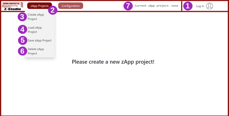
Figure 2: Project Creation View
Directly from the beginning, the Configuration section (8, Figure 3 allows the configuration of external APIs. This is generally covered by the configuration possibilities of the ZDMP platform, but reapplied here, as this would enable adjustments of API connections when the installation was done natively by non-virtual installation (see 1.11.3) or by using Docker Compose (see 1.11.4). Each of the components available to bind at are separated by larger headers (9), like the HCE, and carry suitable input fields (10) where parameters like the URL, Access Token, Authentication credentials, and similar can be adjusted towards the needs.
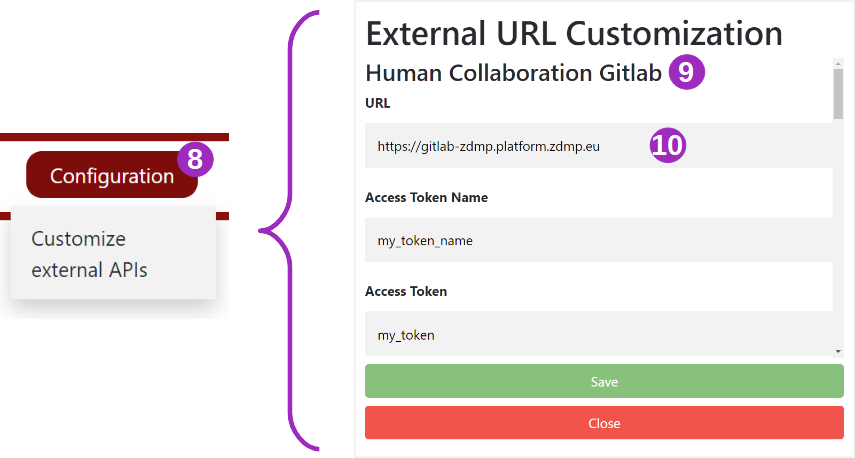
Figure 3: External API configuration
Once a new zApp will be created, an application name needs to be inserted to proceed.
Prototyping View
Nesting application templates
The prototyping view (Figure 4) is the first view being accessed after successful project initialisation. As the title stats, it guides developers through the process of creating a first prototype / mockup of the zApp to be developed, with the ability to do more concrete implementation, which will be covered later.
The entry point is an XML-based layout structure (11), showing in an understandable way which elements are included in the zApp. Elements can be added to the XML view by clicking an item in the template view (13). There is a small panel in the middle with information about the current layer, one can orientate on. In general, there are three layers of a zApp:
| Layer-Nr | Accessible components | Description |
|---|---|---|
| 0 | App | The application-body and frame of the whole Angular application, contains a set of most necessary services |
| 1 | Pages, Services | Pages which will contain several UI components with / without additional attached functionality executing on that page. Also, additional services can be added, which will operate over the whole application |
| 2 | Page-Components | Various components which either can be plain UI-related or bound to functionality |
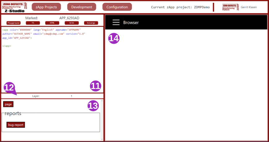
Figure 4: Prototyping View
The template view (13) will adjust its representation depending on the current layer, which is currently selected in the XML (11). The <app>-element, so layer 0, directly is present from the beginning as it is mandatory to form an application body. When the developer clicks within the <app>-XML / within layer 0, templates for layer 1 are shown. The same behaviour applies, if the user has chosen the <page> element from layer 1 and clicks into the layer: Elements from layer 2 will be shown.
| Note: While some of the templates allow to include sub elements, others are self-contained and do not allow nesting. | |
|---|---|
| Frame for sub elements | Self-contained |
 |  |
Since the creation of a zApp, additional buttons have been added at the top of zStudio: One of them is “Development” (15). Besides access to “Prototype” (16, the current view visible), “Translation” (17) settings or some “Log”s (18), the developer can build the result of the XML scheme created. It will take some compilation time and will serve the newest result to the preview frame (14).
Customizing application templates
After the first decisions, which elements to include within a zApp, the elements can be adjusted and customised individually. Every individual template has its own set of attributes to set and manipulate.
To access the functionality, the XML template to be configured needs to be clicked directly at the tag instead of clicking in between the tags.
Due to the changed purpose, the layer and template view (12+13) changes into an element-name view and an attribute view (21+22).
By clicking the template to change, it will be marked (20) and updated as selected in the element-name view. All available attributes to this template are shown and can be changed / adjusted for customisation. In the example of Figure 5, the <app> tag was chosen, representative for the whole application, and is about to be changed in the overall colour.
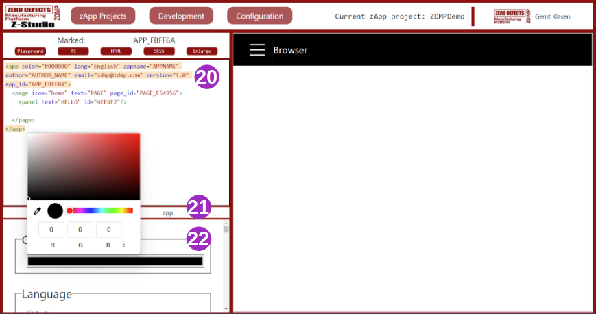
Figure 5: Changes template attributes
Translation view
Lingual inputs, such as the zApp name, page name or panels, are definable by the users themselves. This happens with a key-value-concept (Figure 6). In this example, the zApp name is associated to the key “APPNAME”. A switch to the translation view must be made to define that. Having a look at the view in question, a table can be seen with multiple columns. The first column is for the ID of the lingual entry and the following ones are for counterparts of this key in different languages.
There are already several language key-value inputs (23) defined for some terms, such as the “APPNAME”, or page names (“HOME”, “TEST”). If users need additional translations, they can insert values in key-value inputs (23) and confirm the done work with submitting the translation (24). After the server saves it, the translation will automatically be added to the default list already shown, and it becomes selectable in the prototype view. Of course, translations that are not needed any longer can be deleted (25). For that, translations are selectable via the radio button on the left. Their current translations will be then inserted into the input fields, allowing deletion, modification, and resubmission.
If users wish to submit a new language (26) to be translated, they need to insert the name of the language and submit it by pressing the respective button. Every key needed will be copied, assigned with a default placeholder as a translation and saved. The developer can thereafter assign all translation values to the new translation.
Aside from the headers in the table (except the ID), a current language section (27) gives an overview about all languages supported so far.
From the menu within the zApp, language can be switched after rebuilding, and this switch uses entries inserted by developers in the translation table.
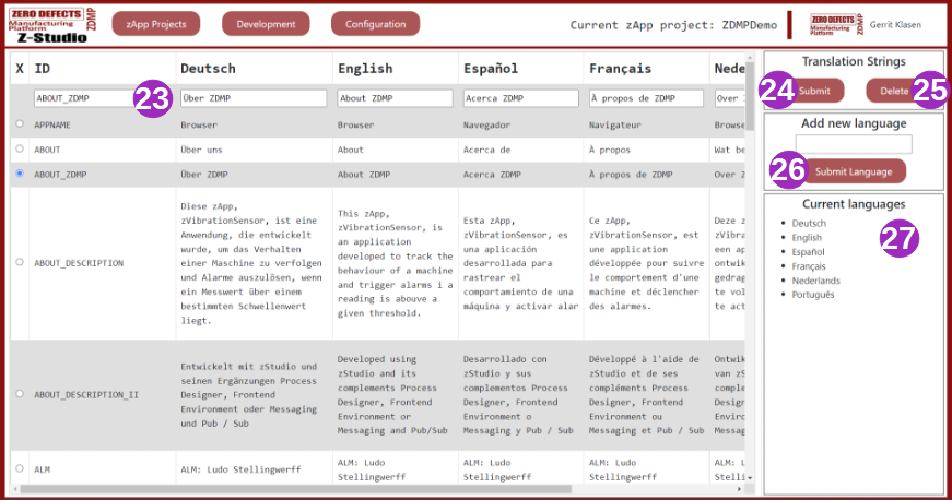
Figure 6: zStudio’s Translation View
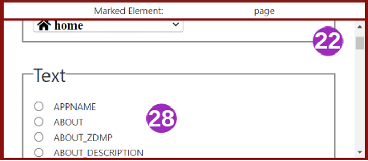
Within the prototyping view, during the customisation of the templates (see 1.12.2.2), many templates will require textual parametrisation within the attribute view (22). This is where developers will assign their translation IDs (28).
Logging View
Whilst developing an application, it is common to face issues and get errors. In this case, the build process fails, and the preview shows an error message instead of elements of the zApp, added by the developer. To find out the exact reason for the problem that occurred and to debug it, the developer can see the log section for more information (Figure 7).
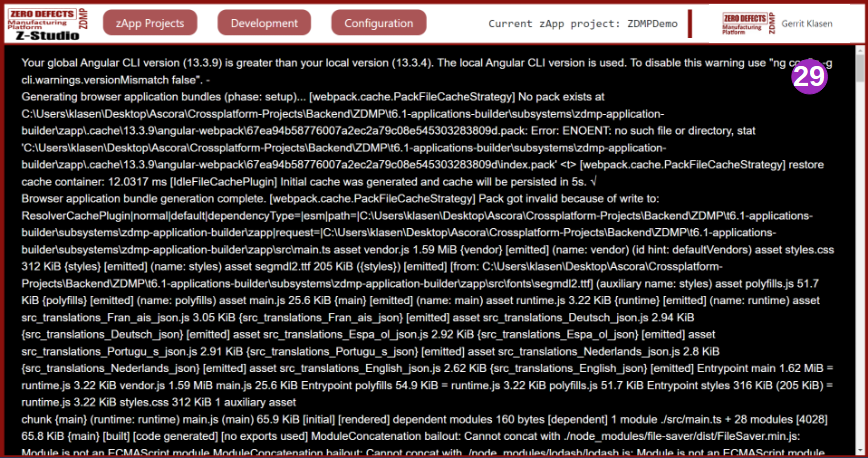
Figure 7: Log-View
Configuration for Docker containers and the ZDMP Marketplace
Introduced in section 1.12.1, the configuration button (Figure 3, (8)) got extended after project creation by two additional options: “Manifest configuration” (30) and “Deployment configuration” (31) (see Figure 8). Both Manifest and Deployment configuration files are required by the ZDMP Marketplace along with a Docker image of the zApp.
The Manifest file created will contain the necessary information of the zApp needed to be displayed in the marketplace, like the product name and description, images sources, environment variables and API configuration.
The deployment file contains information about all dependencies regarding zStudio with other components in forms of Helm[4] charts to be compliant with Kubernetes and therefore with the ZDMP Platform and its whole infrastructure.
Once the configuration of both sections has been completed, developers can either download a local copy of the resulting Docker image (32) or publish the solution to the ZDMP Marketplace to be distributed.
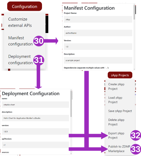
Figure 8: Manifest- and Deployment Configuration views
Overview of UI elements available in Application Builder
On different abstraction layers of the zApp, different UI elements are available. Following is a brief description of the UI elements zStudio provides:
Page
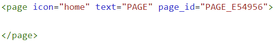
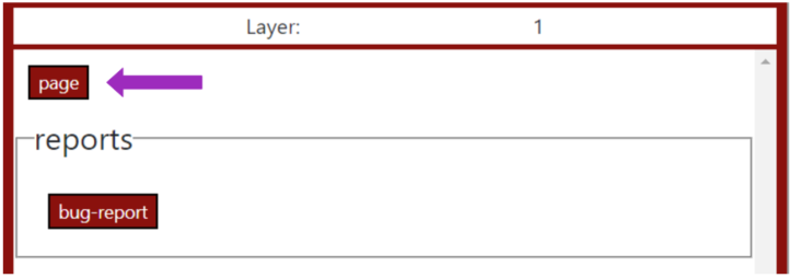
Simple pages can be added inside the main zApp. An example of this has been given in section 1.12.2.1: To add a page, the user has to be inside the <app> tag in XML view, then click on the page template in the template view. In Figure 9, three pages have been added. Then, each page was clicked directly within the XML to open the attribute view. There, different IDs for the page names have been selected. A final build compiled the changes and let to the representation in the prototype view. The user can move between them from the main menu bar of the zApp. Pages in theory also can be linked to UI elements and, for example, one can move from page to another with a button click.
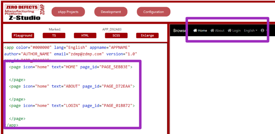
Figure 9: Pagination in a zApp
Reports
As service-representative element, Layer 1 also has another template: bug-report. It can be used to send error reports to the developers. These bug reports include error messages and the stack trace of the bug, which can help developers to debug the code, remove errors, and update the zApp accordingly.
Common UI elements
Inside pages, further UI elements can be added. These are divided into different categories based on their usage. In Figure 10, common-UI-elements (28) are shown. These include buttons, a clock, notifications, and a separator, etc. Any of these elements can be added by clicking on the respective button in the template view. After adding an UI element, the zApp has to be built to see the changes in preview.
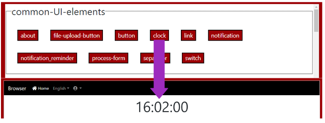
Figure 10: Common UI elements
Charts
Provided is also a variation of charts including (but not limited to) an area-chart, a bar chart, a heatmap, a pie chart, and a polar chart. These charts can use data stored in a local file URL or public URL in JSON format, but also can connect to streaming data, like to the ZDMP Message Bus. The latter will be shown in practice in section 1.12.4, where an example zApp will be developed. From the attribute view of the charts, the data source can be adjusted to point to a specific source file. Figure 11 shows a single page zApp with a bar chart in it, referenced locally:
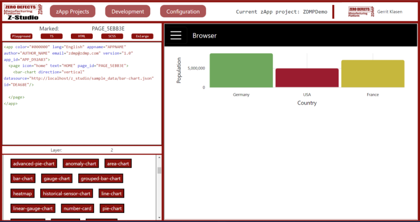
Figure 11: UI elements – charts
AI Analytics
The AI-analytics (Figure 12) element enables the prototypical integration of the ZDMP AI-Runtime. A user can send values to already trained AI models and get back the result. The desired model can be given as an attribute to the element by clicking on the <ai-analytics> tag in XML view. The result received is then displayed in the form of a table.

Figure 12: Analysed CSV-data
Media
UI elements in the media section allows users to add audio, images, and videos to their zApp. They all require a source attribute, which points to an audio, image, or video file to be used as the source file. shows an audio file added to the zApp.
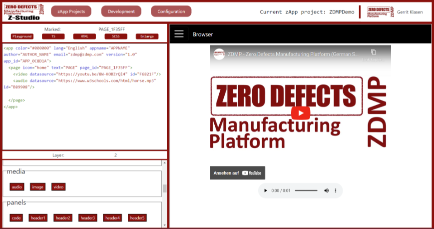
Figure 13 : Media-elements within ZDMP
Panels
For adding different headers of different sizes or writing text in coding style, elements from the panels section can be used. Figure 14 shows a header with the text “Hello world!” in the zApp which has already been added by clicking on the ‘header 1’ button from panels.
CSV
The CSV section includes two UI elements named “csv-reader” and “quality-analysis”. The CSV reader is used to upload CSV data, after which it reads the data and displays it in form of a table (Figure 14). The element analyses the quality of data using the AI-analytics component and displays the result in the form of a graph. The quality analysis element also allows users to export a CSV file based on the results of the analysis. As always, this prototypical use of data is a starting point for developers who can use the same approach to build more complex use cases.
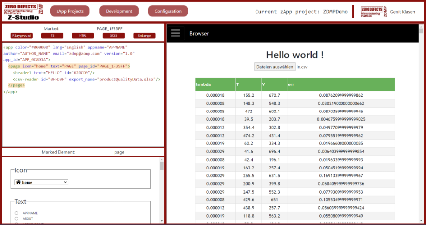
Figure 14: UI elements – panels and CSV
Logs
The logs are used to log messages and errors on the console. This components will would within the context of a zApp and is not about to be mixed up with the zStudio logging presented in section 1.12.2.4.
Forms
The forms (35) section provides different form controls to add date-, number- and text-typed information with a submit form button.
User management
The UI elements in the user-management section are used to register a user with ZDMP and login the user (Figure 15), further change the password and get information of the user who is logged in. All the controls in this section can be added only once in each zApp, and that is the reason the login control cannot be seen in this section, as it is already added to the page once before. After logging in, the user’s information is verified using the Secure Authorization and Authentication component so that the user can access all other ZDMP components.
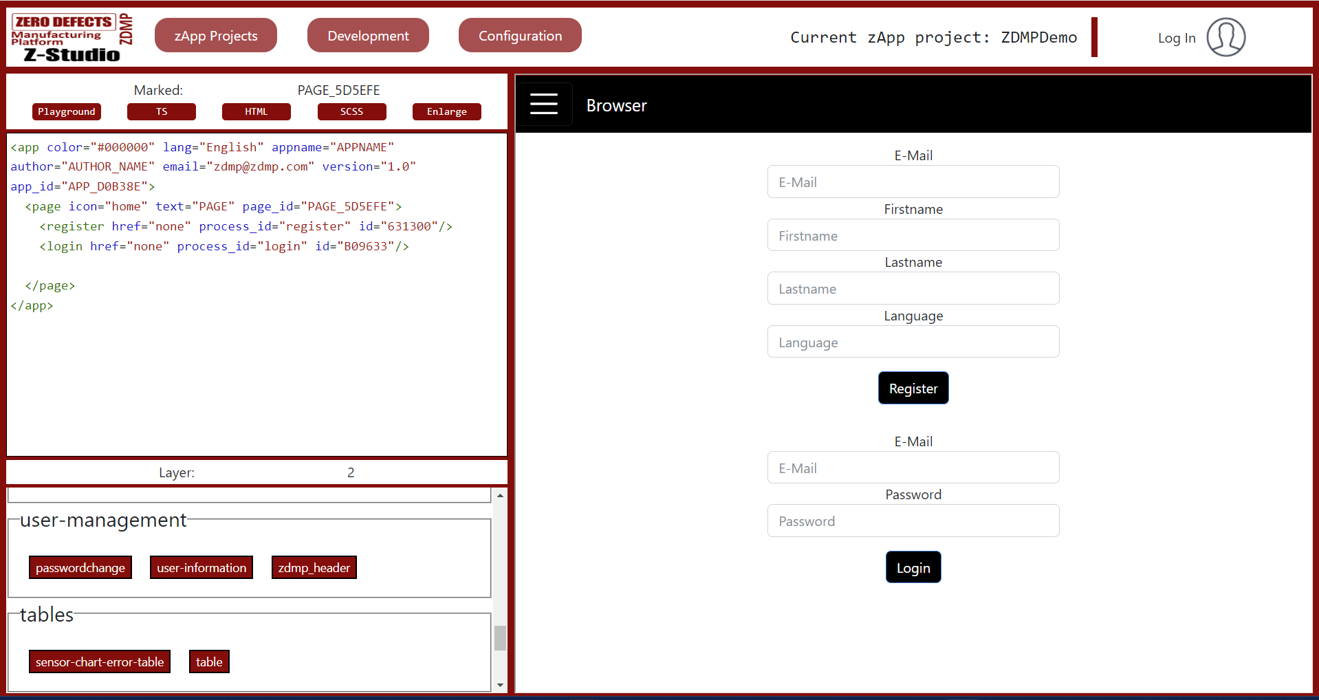
Figure 15: User registration and authentication within a zApp
Tables
Two types of tables can be added using UI elements available in tables section: Sensor chart error tables and simple tables. The error table takes a ‘process id’ as an input parameter and displays all the errors related to this process in the form of a table. If there are no errors to display, an empty table is shown. The table element takes a JSON data file as an input parameter and displays data as a fixed-height table. Figure 12 already has shown how tables would look like.
Message bus
The message-bus (38) allows a user to subscribe or unsubscribe to any topic of the message bus, receive, and send messages to topics and view the incoming messages in the form of a graph or raw data. Section 1.12.4 will demonstrate that as part of an example application, in where we receive streaming data and display it upon a chart.
Monitoring and alerting
The UI element “create_kpi” in the zStudio enables users to monitor data coming from the message bus. “create_kpi” allows a user to enter a topic / KPI name and the corresponding value to monitor. The “create_alert” element however give opportunity to define, when such KPI values reached a point, where ZDMP stakeholders should be informed about anomaly. Users can also provide multiple emails, to which they wish to send alerts in case the value goes out of range.
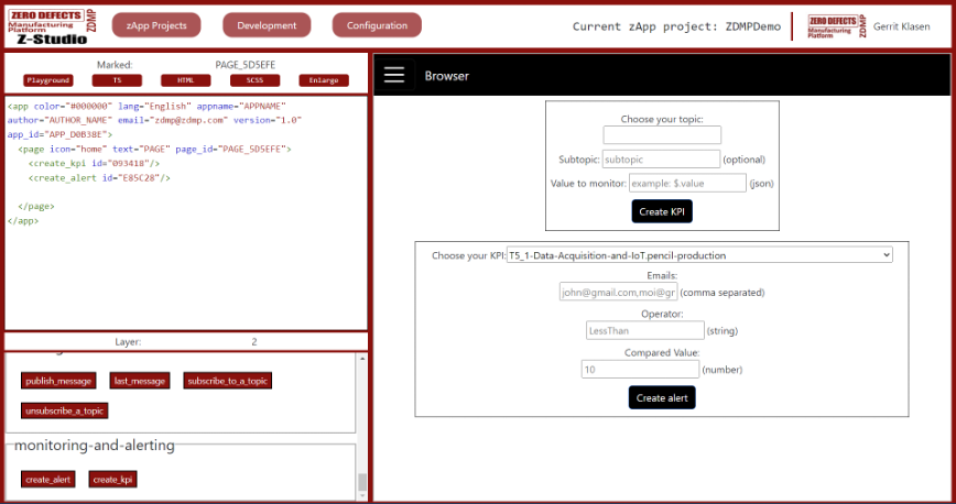
Figure 16: UI elements – Monitoring & Alerting
Example zApp
In this section, the development process of a simple example zApp is demonstrated and described in detail. For this example, it is assumed that zStudio already is deployed within a local MiniZDMP environment as explained in section 1.11.2.
In this example, a zApp will be created, which contains two pages:
The first page will shortly explain the intention of this solution and give possibility to use the message bus to subscribe to data streams.
The second page will allow users to see a chart where the received data will be displayed in a more understandable way, telling users when anomalies from the machine happen.
Firstly, lets create a project. For this, click on “zApp Projects” and “Create zApp Project”.
Enter a name which suits the usecase, like “ZDMPAnomalyCheck_<username”>:
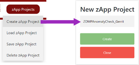
zStudio will now state that it will create a new project. Please wait for this to complete.
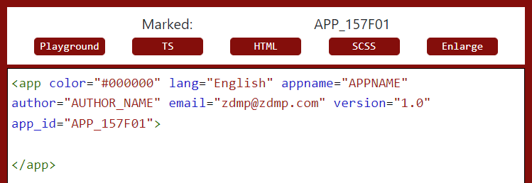
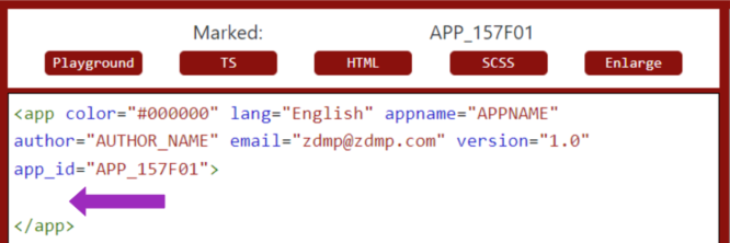
On the initial view, the <app>-body of the zApp already is initialised by default:
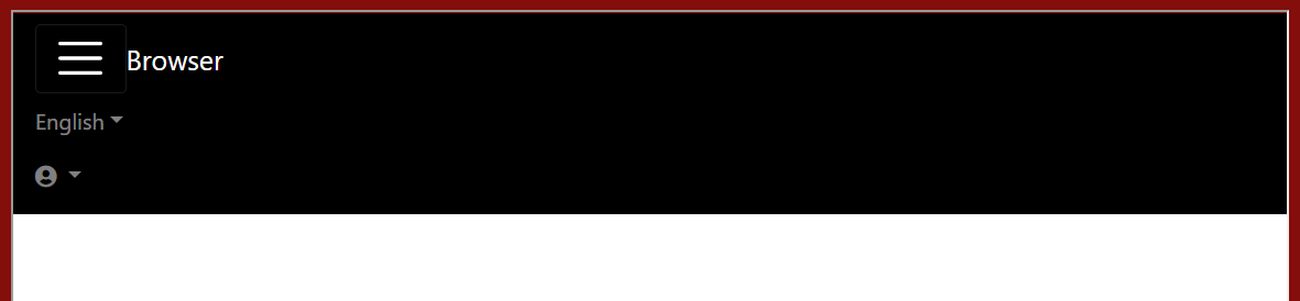
The same applies for the first prototype preview: It has the application name only on the left, and language- and User-Management settings on the right:

| ! | NOTE: On smaller screens, representation will differ: The zApp resizes that it shows a menu button, which will show above elements by unfolding the menu like below. The following How-To will use the “wide screen” representation.
|
Once the initial project is visible, the two pages to create content on need to be created. Click into the <app> tag to open the template view like explained in section 1.12.2.1.
The layer panel will show that we are in layer one, and the template view will present services and pages to add to the application. We want two pages within the application, so click “page” two times.
The XML scheme will now look like below on the left. To see the changes from this in the prototype, go to the zStudio title bar menu, click “Development” and “Build”.
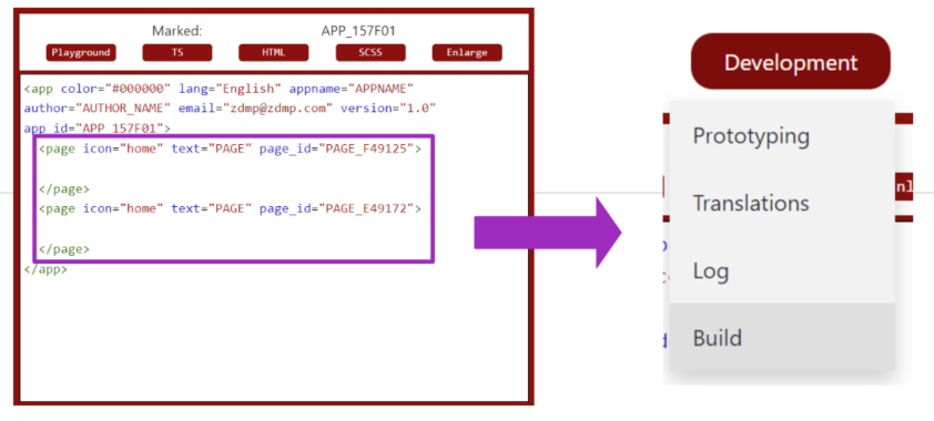
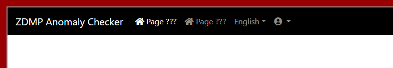
zStudio will prompt “Rebuilding”. Afterwards, the preview will have changed in the menubar, as two pages have been added to the application:
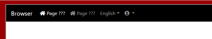
For now, the pages as well as the application use default translations without hints what the page is for. For that, the next step is attaching custom translations to them.
Choose “Development” again from the top menu bar of zStudio and select “Translations”.
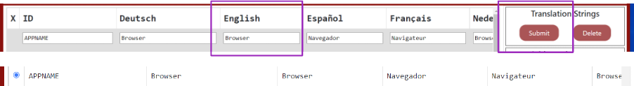
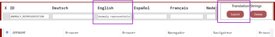
This will open the translation view like in section 1.12.2.3. The key “APP_NAME” is attached to the application name. Scroll down to it until you see the ID with English translation “Browser”. Rename it to “ZDMP Anomaly Checker”.
For that, click on the radio button next to “APP_NAME” to make it modifiable. For this demo, we only change the English translation, but in general, be aware that every language supported needs a suitable translation. So, replace “Browser” in the English section by “ZDMP Anomaly Checker”. Under “Translation Strings”, click “Submit” to update changes.
If interested, do a rebuild again and see changes:
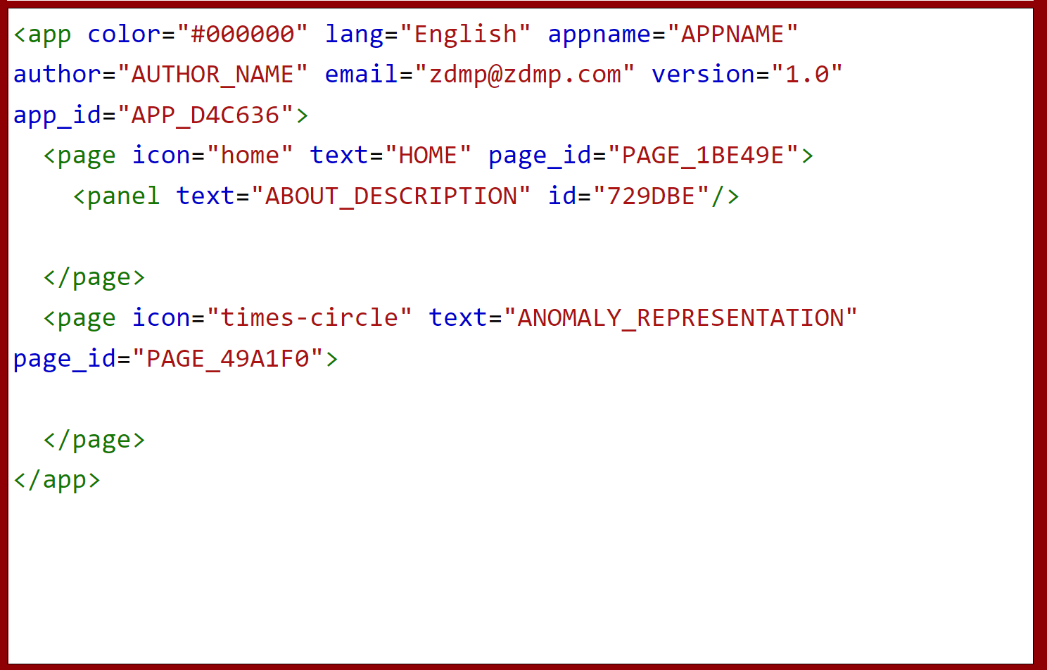
Let´s do the same for the two page: Go to the translations page again. As the first page is supposed to give a small welcome to the zApp, look for suitable translation ID in the basic dataset. For this case, “HOME” will fit to be used later. The second page, however, will display interpretations about machine anomalies. In this case, no suitable translation is present, so one needs to be created:
Click on the empty input below “ID” to define a new translation. Put something like “ANOMALY_REPRESENTATION” as ID and eg “Anomaly representation” representation as English translation. You can leave out other translations, they will be filled with placeholders.
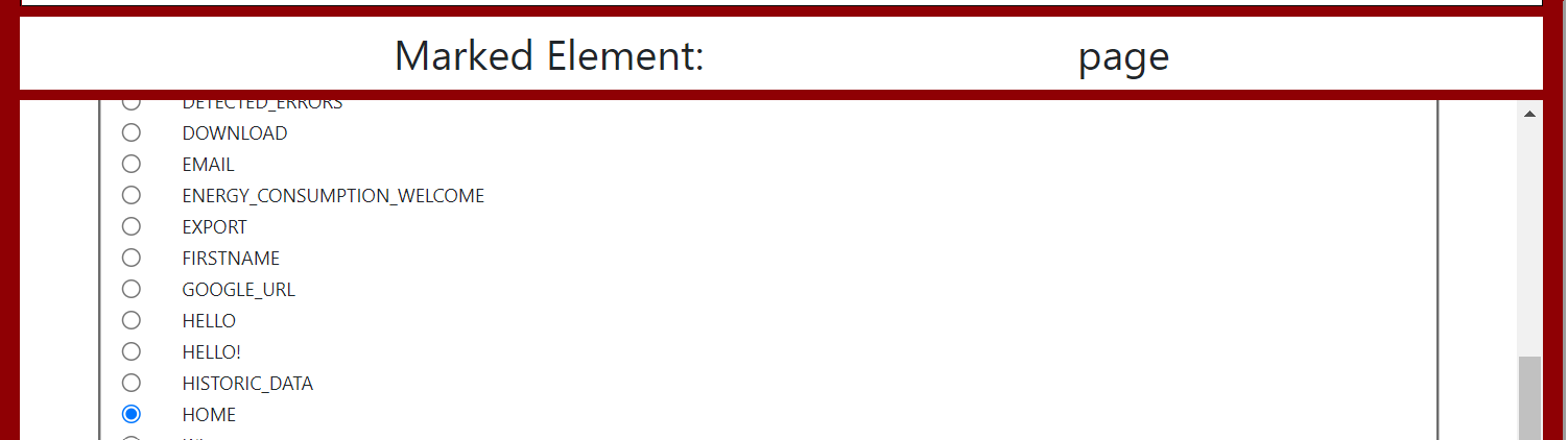
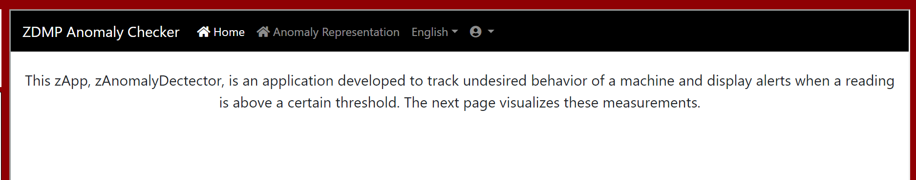
We now have the translations we need for both of the pages. Go back to the Prototype view. Click directly on the XML tag for the first page, to trigger customisation like in section 1.12.2.2. The template view for the page will open on the bottom left. Select the text for the “home” page which already was identified as suitable: Within the header “Text”, scroll down until the key “HOME” is visible to select. Apply the translation for that key to the first page.
The icon displayed for the page in the menu bar of the zApp already should fit here.
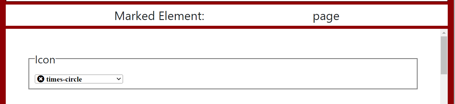
Now, click on the XML tag for the second page. Attach the translation we just created within the translation view, “ANOMALY_REPRESENTATION” the way we did for the first page. Regarding the icon, attach a more suitable icon, like “times-circle” or similar.
Rebuild now to see changes, which should look similar to this:

This concludes our structure in general.
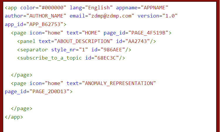
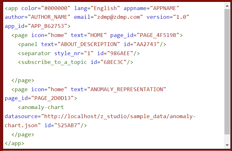
Next, functionality needs to be attached. First, we add a general description. Click into the XML of the first page to open the template view below and add a “panel” element from category “panels”. For this example, to ease, the translation “ABOUT_DESCRIPTION” already is provided. Select the recently added panel and choose that ID as “Text” attribute. The result should look like this:
Rebuild to see this:
Click into the first page again. Add a “separator” form “common-UI-elements” to give your app some structure. Also add a “subscribe_to_a_topic” from “message-bus” category to be able to listen to broadcasts from the message-bus and to listen to anomaly data from outside. Rebuild. Result in the XML and preview is:
And:
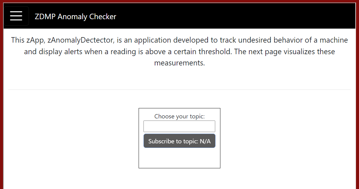
The first page is complete: It gives an intro into the zApp and is able to listen to the ZDMP message bus.
The second page needs to be about representing the data in a chart which gives maintainers an overview about the current status of a machine.
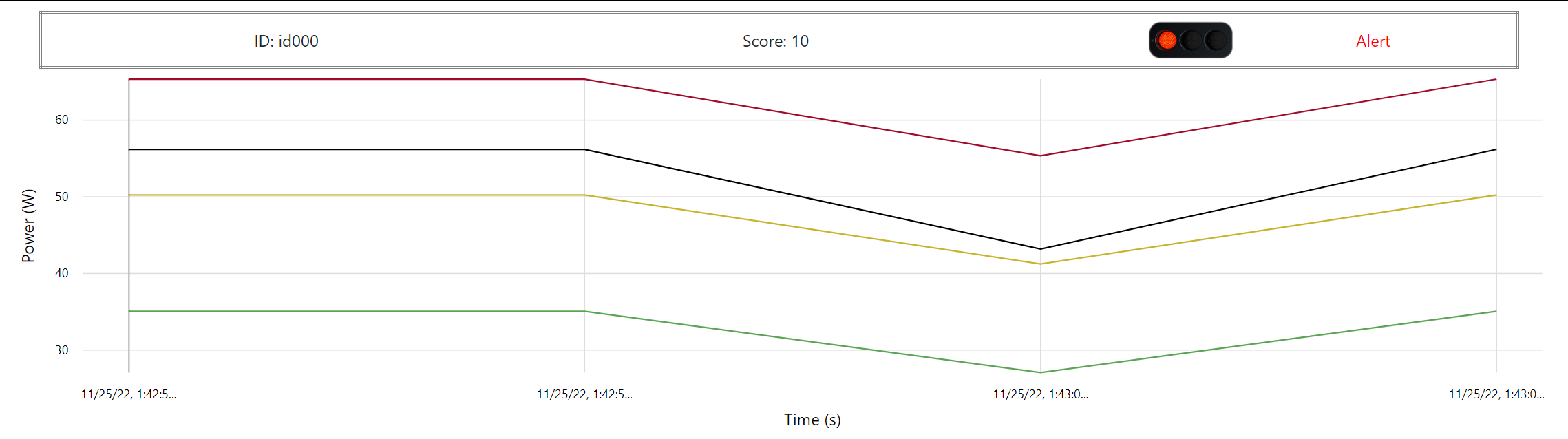
This being said, click into the second page to add a suitable chart from the template view: An “Anomaly chart”. Navigate into the second page of the XML view, to select that element from the category “charts”. Rebuild. After competition, click on the second page within the zApp menu to see this:
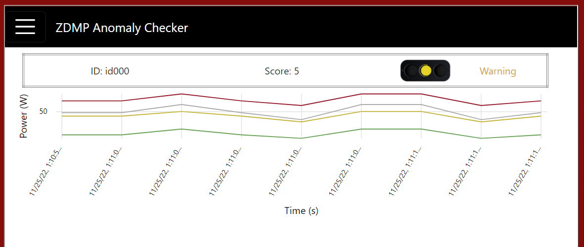
The XML now should be similar to:
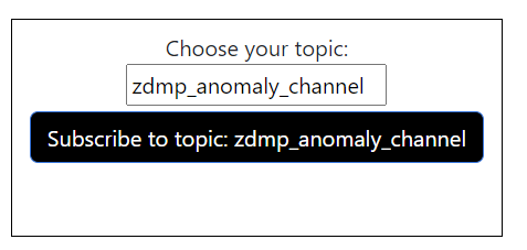
The chart displays example data from a local JSON file to show how it is working. It will be replaced by data from the ZDMP message bus when you subscribe to a topic. The “building” part hereby has finished. The step left is to stream real data. Navigate to the first page of your zApp and subscribe to the topic you can connect to, here, assuming “zdmp_anomaly_channel”:
Once completed, back onto the second page, the table will update with values from this channel and show, if anomalies are not happening, close to happen, or indeed occur.
Congratulations! The first zApp prototype is ready.
Extended code customization
The tutorial shown has based on XML-based-layout structure so far. This kind of view is called “Playground” (34), as it allows developers to add and remove elements in a Plug-and-Play mechanism to “play” around with components. Also, certain degree of customisation has been shown be clicking XML directly and attach attributes to it. An even deeper degree of customisation is possible by selecting the XML template directly again, but accessing its Typescript, HTML and / or SCSS code (35-37).
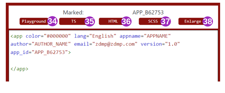
If developers click on the second page of the example, the follow would be seen by selection “TS”:
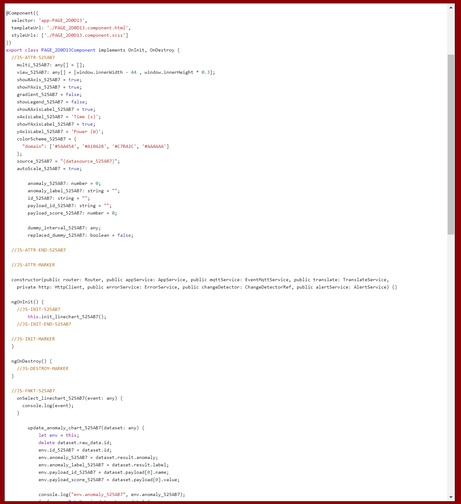
The code is the representation of a classic page from an Angular application but extended by elements users have chosen in the XML view, in this case by attributes and methods from the anomaly chart.
As this code might be small in the current window representation, users are able to click “Enlarge” (38) to hide the prototype view and to see the code in a bigger part of the screen. Code representation will happen for the HTML and SCSS view in the same way, but in the corresponding format.
Assuming, developers are fine with the chart, but do not want to have values represented in grey colour, which some might not see, changes directly can be done in the TS of the page and the anomaly chart element, by replacing the colour scheme.
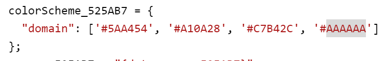
… from #AAAAAA into plain black, which is #000000. After a rebuild, the result is:
The same “fine-tuning” applies to the HTML / SCSS of the pages.